Improving Covid-19 Data and Evidence Communication
Prof. Chris Dent on issues surrounding communication of COVID-19 data
Communication of Covid-19 evidence and data has been a live political issue recently. Following the Westminster government’s announcement on 31 October 2020 of a new lockdown for England, there has been much criticism by the media and by politicians of the evidence presented by the government’s scientific and medical advisers. This culminated on 5 November 2020 with a statement from the UK Statistics Authority, which very directly criticised lack of transparency in the government’s communication of data [1].
This article examines issues that have arisen in recent government communications, drawing extensively on the author’s experience of applied modelling and evidence communication in the energy industry, including in the politically sensitive area of security of energy supply.
It must be recognised that the government’s scientific profession has an incredibly challenging task, presenting advice on a new disease on which basis the government will take some of the gravest decisions seen in peacetime. I thus intend this article to convey a positive recommendation of what constitutes good practice. However the story of government communication over the last two months contains enough bad practice that it is impossible to avoid serious criticism. Indeed prominent examples of easily-avoidable poor practice have to a great extent undermined the credibility of the scientific work which underlies it, much of which will be of excellent quality. I am far from alone in this criticism; as an example, David Spiegelhalter (Winton Professor of Public Understanding of Risk at the University of Cambridge and the 2020 Centre for Statistics David Finney Lecturer) said in an article on 7 November:
“It has been a mess, it really has. All those graphs that got put up at the press conference last Saturday, the projections were out of date at the time, they’re definitely out of date [2].”
This article is very detailed, as it is necessary to describe the various prominent examples precisely to make the article’s arguments – among other preparation, I took one for the team by watching back the prominent presentations cited, and listening to all 165 minutes of a parliamentary committee session so you do not have to. I thus proceed by describing examples, and then the broader messages which may be drawn from them.
Scenarios and predictions
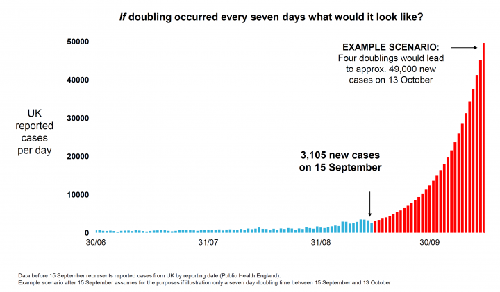
On 21 September 2020, the Westminster government Chief Scientific Advisor (CSA) and Chief Medical Officer (CMO) gave a televised evidence presentation in which the CSA presented the following graph [3], showing what would happen if the number of confirmed cases doubled every week:

The CSA emphasised that this was a scenario of what might happen and not a prediction of what would happen, but it was widely interpreted in political and media debate as a prediction. However it is widely recognised among people who specialise in evidence communication that if one presents a single scenario, despite any caveats that are given, it will be interpreted as a prediction. I am thus very surprised that the CSA fell into this common trap, as all that was required was presentation of two scenarios (optimistic and pessimistic) with the message that we need to be prepared for the pessimistic one but hope that something more like the optimistic one occurs.

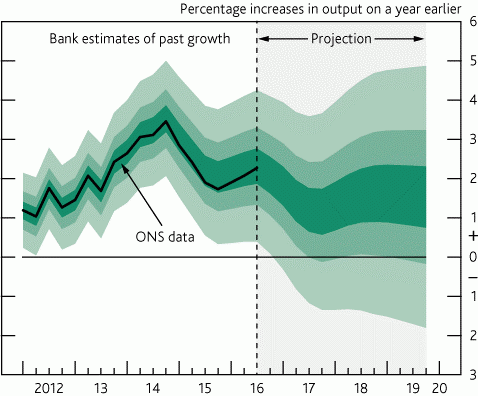
The Bank of England’s ‘fan charts’ are often held up as an example of good practice for presenting uncertainty in projections. In technical terms, at each point in time a fan chart shows a probability distribution of possible outcome at that time; in more colloquial language, the darker colours in the “fan” represent the more likely possible outcomes over time. An example is shown in Graph 2.
A key point to note is that in forward projections there is no central estimate given in the Bank of England chart – this is designed to force the reader to engage with the fact that there is uncertainty, as there would be a tendency for people to ignore the uncertainty and take the black line as the prediction if it were extended into the future projection. Interestingly in its uncertainty methodology document, the Office of Budgetary Responsibility does not recognise this, and presents a central estimate [4]. I have observed similar in electricity security of supply studies, where if an odd number of scenarios is presented there is a tendency for the audience to interpret the central one as a single point prediction (a good reason to use an even number of scenarios as there is then not one ‘in the middle’!)
Presentations versus reports
As part of the explanation of that ‘scenario not a prediction’ from 21 September 2020, the CSA gave an estimate that the number of new cases was doubling every week, which was the basis of the scenario presented (and directly undermined his statement that the scenario was not a prediction). However he did not say how that estimate was made, and the dataset used for the historic part of that graph did not suggest such a short doubling time. Moreover in an appearance before the Science and Technology select committee on 3 November the CSA stated:
“It turns out that it does look like what we said, not because it doubled but because it started from a higher baseline, but those numbers turned out to be just about exactly where we ended up in October [5].”
This is hard to reconcile, in the absence of further explanation, with the fact that by 13 October 2020 the data represented by the blue bars on the scenario graph (the number of confirmed cases) had reached only about 1/3 of the 13 October level projected in the ‘scenario’. It may be that the total number of infections in the country as estimated by the Office for National Statistics [6], including those not confirmed by testing, had reached around 50,000 – but that is not the dataset plotted on the original graph.
![Graph 3: Slide 3 from the CSA's 31 October 2020 press conference[7]](https://centreforstatistics.maths.ed.ac.uk/sites/default/files/styles/landscape_breakpoints_theme_uoe_mobile_1x/public/thumbnails/image/cd-covid3medium.png?itok=wXz7kvaP)
This is an example of the futility of trying to communicate evidence through oral presentation with slides alone, without an underlying report giving a more complete explanation of the origin of data and evidence and the logic of its interpretation. I have seen this quite commonly in energy industry and policy communication, where slides are produced in place of a written report, with the inevitable result that they both work badly as slides and do not fulfil the role of a written report.
There were further examples of regrettable lack of detail in the CSA’s 31 October 2020 press conference presentation [7]. Slide 3 (Graph 3) attempts to convey a subtle message about how different modelling studies with different sets of assumptions provide different scenarios of possible futures, as an input to debate and decision making. Again, it was inevitable that this would create confusion in the absence of a more detailed written explanation of how this set of scenarios should be interpreted.
There has been criticism of the most pessimistic scenario for having, at the date of the press conference, a number of daily deaths that far exceeded the actual numbers at the end of October. In the absence of this inconsistency with the prevailing empirical data being acknowledged and explained, I regard this criticism as being entirely legitimate – it may be that the idea was the scenario might happen but shifted back in time, but this was not the message given. Returning to my theme, a written report is required to provide a more detailed explanation.
Finally, slides 4 and 5 of this presentation did not make sense in any terms – they present essentially the same plot for daily Covid hospital admissions then deaths between March and December, so for simplicity I shall discuss only the deaths one. The original plot on slide 5 is shown in Graph 4, on the left:
The logical problem is that the plot presents empirical historic data up to 27 October 2020, and then the day after the historic data ends it gives an uncertainty window of a factor of 2 in the projection for the subsequent day (and as the uncertainty is represented by an interquartile range the full spread will be wider still). This clearly is anomalous, and so I am surprised that this slide was ever presented. A few days after the press conference, a new version of this pair of slides was issued, with the new Slide 5 plot shown in Graph 4, on the right.
![Graph 4: The original Slide 5 (L) and the updated Slide 5 (R) from the CSA's 31 October 2020 press conference[7]](https://centreforstatistics.maths.ed.ac.uk/sites/default/files/styles/landscape_breakpoints_theme_uoe_mobile_1x/public/thumbnails/image/cd-covid4and5.png?itok=GDLc_61y)
The interquartile range now makes sense, however the note that “This [amendment] does not affect the insights that can be taken from these analysis” seems illogical – no insight can be taken from the original version, as it must be disregarded due to the internal logical contradiction, and anyway there is no explanation of what this unchanged insight is.
Returning to my theme yet again, all of this could be avoided if better practice in data communication had been followed, and an appropriate written explanation given as soon as possible after the press conference – the press conference was given at short notice, but underlying thinking must have existed, so producing a report would just have been a case of putting that thinking in writing. There are now good written reports available on the press conference ‘slides and data’ (see footnote 7) detailing how the projections and scenarios on slides 3-5 were produced, though there is still no written report on the key point of how they should be interpreted.
Use of logarithmic scale plots
There are various issues with the editorial presentation of plots. I shall not go into this much, as that really would be death by detail, and make for a rather dull section. Suffice to say that I regard the Bank of England fan diagram from the previous section as an example of very good practice here (the numberings are a legible size, the axes contrast sufficiently with the background, and tick marks are clear). However the typesetting of the government Covid-related plots in the previous section are less ideal (that from 21 September 2020 presented in Section 1 has no axis lines or even tick marks, and on those presented in Section 2 from 31 October 2020 the font is rather small and the axes and tick marks very faint).

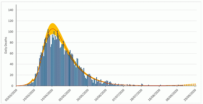
I do wish however to discuss one common design choice. Almost universally in broadly aimed presentation, a linear vertical axis is used, on which intervals represent a constant range. In the case of the following Scottish Government plot of daily deaths over time (Graph 5) [8], the interval on the vertical axis is 20 daily deaths.
Unfortunately, however, these linear plots are often not very informative, as Covid data span very wide ranges – in this case from low single figures to just over a hundred. In this case, the interesting part is intended to be the recent data and forward projections at the bottom right, which is almost illegible due to the earlier higher peak. We thus have here a prime example of where a linear scale plot does not really communicate anything to anybody.
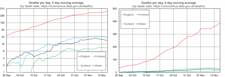
The alternative is to use a logarithmic scale. Some readers will already have thought this, but for others I shall offer an explanation. It is easiest to do so visually, through the following representation of death data from the four home nations which I produced myself for a period during the growth of Covid cases in the autumn (Graph 6, left).
The vertical axis uses a logarithmic scale to base 2. This simply means that the intervals on the axis now represent a doubling. This brings the advantages that data from ranging over a factor of over 100 can easily be visualised, and that one can immediately read off doubling times (which are simply how long it takes the data to go up by one grid line).

A key mathematical property of logarithmic plots is that exponential growth, where the data doubles every time a given amount of time has passed, appears as a straight line. For instance in this plot it is clear that the number of deaths per day grew exponentially in England throughout October (with approximately three doublings in five weeks) before levelling off in November. Trends in the other home nations are similar but a little less clear, due to their smaller populations. In particular, in Northern Ireland the rate of deaths per day peaks at about 10, so there is a lot of statistical fluctuation about any trend.
This is in contrast to the linear scale plot of the same data presented next (Graph 6, right). Here it is not clear that there is an exponential trend (ie a regular doubling time throughout this six week period), and due to the much larger population of England it is not possible to distinguish the data for the other Home Nations.
There is some concern that logarithmic plots are not suitable for broad public communication, see for example commentary from LSE [9] and the paper which underlies it. I find this logic unconvincing on a number of grounds, the first being the point above that often linear plots simply do not convey anything. Secondly, it would be interesting to see how understanding of logarithmic plots improves if an explanation of their meaning is given, as in my attempt above in which I refer to doubling times.
It is hard to carry out rigorous studies on efficacy of logarithmic plots for public communication. In the LSE paper an example was chosen where the linear plot is informative, and there is the question of how much explanation is provided. Utility of such studies is also complicated by there being multiple audiences for evidence – clearly televised briefings are aimed at the broad general public, though any underpinning report might be aimed at a more data-savvy audience, and it is important also to communicate to expert audiences that evidence has been assembled in a robust manner. Of course, if there is concern over whether logarithmic plots will be understood, in a written report one can simply use both.
Conclusion
This article has contained a lot of criticism. I am not entirely comfortable with this myself, due to the need to acknowledge the immense pressure under which the government’s scientific advisors are working on one of the greatest peacetime challenges the world has faced. Unfortunately, criticism is inevitable, as a lot of the government’s Covid evidence communication has simply been bad, and this has seriously undermined confidence in good work the government is doing and in the use of scientific evidence to support development of Covid policy.
The positive message is that there are simple feasible ways to improve evidence communication, and much of what I have described does not require additional people time. Even providing proper written reports may have a positive payback in people time, due to the reduction in time spent firefighting controversy caused by the lack of a sufficiently clear and detailed statement of the message.
As per the second section of the article, the key to this is a proper written statement of the message to supplement any oral briefing. Provision of underlying data, and even statements of how modelling results were produced, do not suffice, as the most vital aspect is how the data and modelling results are interpreted to provide the evidence which supports policy decisions – and the intent of public scientific briefings has clearly been to explain the evidence base on which policy decisions are being taken.
References:
[1] https://osr.statisticsauthority.gov.uk/news/osr-statement-regarding-transparency-of-data-related-to-covid-19/
[2] https://www.theguardian.com/world/2020/nov/07/england-lockdown-needed-graphs-mess-statistics-guru-covid
[3] Slides for 21 Sept briefing available at https://www.gov.uk/government/publications/slides-to-accompany-coronavirus-data-briefing-21-september-2020
[5] Available at https://committees.parliament.uk/oralevidence/1122/pdf/ - the relevant paragraph is Q1524 on pp 31-32
[6] https://www.ons.gov.uk/peoplepopulationandcommunity/healthandsocialcare/conditionsanddiseases/bulletins/coronaviruscovid19infectionsurveypilot
[7] Slides and datasets available at https://www.gov.uk/government/publications/slides-to-accompany-coronavirus-press-conference-31-october-2020
[8] Fig. 4 at https://www.gov.scot/publications/coronavirus-covid-19-modelling-epidemic-issue-no-19/
[9] https://blogs.lse.ac.uk/covid19/2020/05/19/the-public-doesnt-understand-logarithmic-graphs-often-used-to-portray-covid-19/
Chris Dent is Professor of Industrial Mathematics; Director of the Statistical Consulting Unit at the University of Edinburgh; and a Turing Fellow at the Alan Turing Institute.

